When exploring color schemes for creating a serene ambiance, selecting the right palette is key to fostering tranquility in your space. Harmonizing with calming blue tones or embracing the peaceful allure of soft neutrals can transform your environment into a haven of relaxation. But what about the lesser-known pastel palettes that can quietly soothe your mind? Stay tuned to discover the nuanced art of balancing warm and cool tones, playing with minimalist monochrome schemes, and incorporating earthy colors inspired by nature for a truly harmonious and calming home environment.
Key Takeaways
- Consider harmonious blue hues for a serene ambiance.
- Opt for soft neutrals to create a peaceful retreat.
- Blend tranquil greens and yellows for a calming atmosphere.
- Explore calming pastel palettes for relaxation.
- Balance warm and cool tones for a harmonious environment.
Importance of Color Psychology

Discover the profound impact of color psychology on your emotions and well-being as we delve into the significance of choosing the right hues for creating a calming atmosphere. Color therapy, a practice rooted in ancient traditions, is based on the belief that colors can evoke specific emotions and influence our mental state.
When applying design principles to your space, consider the psychological effects of different colors on your mood. Aesthetics play a crucial role in determining the ambiance of a room. Soft pastel shades like lavender or mint green are often associated with tranquility and can help create a sense of relaxation.
On the other hand, bold and vibrant colors like red or yellow may energize and stimulate the mind, making them more suitable for areas where creativity or activity is encouraged. By understanding how colors interact with our emotions, you can strategically design your surroundings to promote a sense of peace and well-being.
Harmonious Blue Hues
Immerse yourself in the serene and calming world of harmonious blue hues, where tranquility and peacefulness effortlessly blend into your surroundings. Picture the gentle waves of a beach retreat, captured in coastal blues that evoke a sense of relaxation and escape. These shades mimic the colors of the sea and sky, creating a soothing atmosphere that washes over you like a cool breeze on a hot day.
Sky blue, with its ethereal and airy essence, infuses your space with peaceful vibes, reminiscent of clear summer days spent gazing up at the vast expanse above. This hue brings a sense of openness and lightness, lifting your spirits and calming your mind.
Incorporating these harmonious blue hues into your home decor can transform your living space into a sanctuary of calmness and tranquility. Whether you choose coastal blues for a beachy feel or opt for sky blue for its peaceful aura, these colors will envelop you in a sense of serenity that invites you to unwind and recharge.
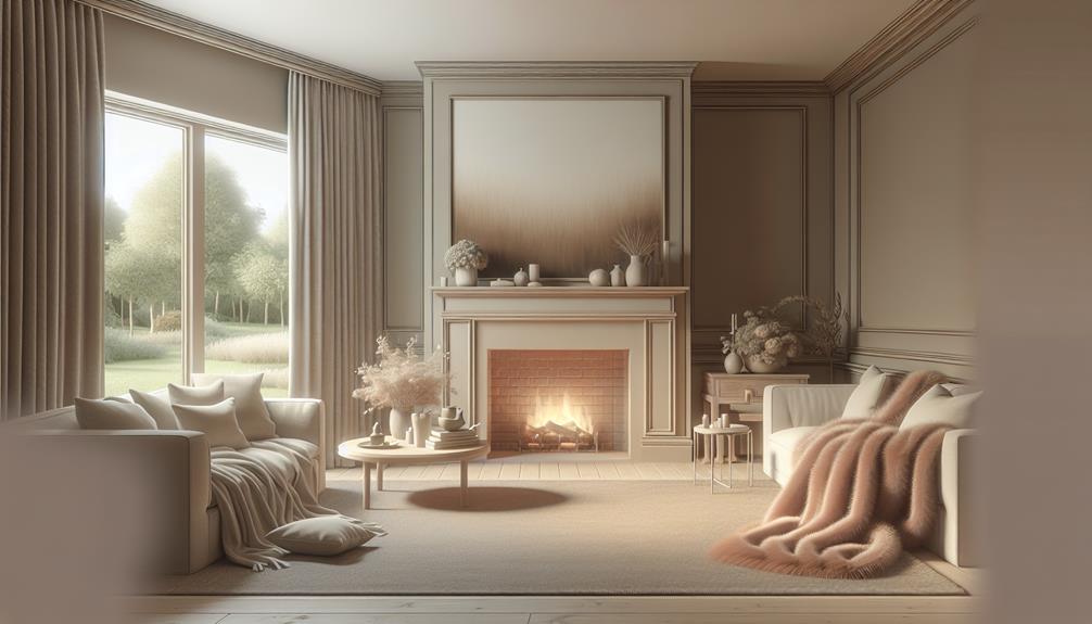
Serenity in Soft Neutrals

Soft neutrals embrace your space with a gentle embrace, creating an ambiance of serenity and tranquility that soothes the soul. These neutral tones bring a sense of calmness that’s perfect for creating a peaceful retreat within your home.
Imagine walking into a room bathed in soft beige, warm taupe, or delicate ivory; the serenity of these hues instantly washes over you, inviting you to unwind and relax.
Versatility: Soft neutrals are incredibly versatile and can easily complement a wide range of decor styles, from minimalist to traditional, adding a touch of elegance to any space.
Timelessness: Neutral tones have a timeless quality that ensures your space will remain chic and stylish for years to come, making them a smart choice for those looking for longevity in their design.
Tranquil Atmosphere: The soothing ambiance created by soft neutrals fosters a peaceful environment, allowing you to escape the hustle and bustle of daily life and find solace in your surroundings.
Tranquil Greens and Yellows
Picture yourself surrounded by the calming embrace of tranquil greens and yellows.
The harmonious nature tones effortlessly bring the serenity of the outdoors into your living space.
Serene yellow hues evoke a sense of warmth and happiness, creating a peaceful oasis in your home.
Harmonious Nature Tones
As you gaze upon harmonious nature tones in tranquil greens and yellows, a sense of serenity washes over you, inviting relaxation and peace into your surroundings. The blend of serene green shades and soothing yellow hues creates a tranquil atmosphere that mimics the calmness of a lush forest or a sun-kissed meadow.
Here are three ways these harmonious nature tones can elevate your space:
- Natural Color Palettes: Incorporating a mix of greens and yellows in your decor can evoke the tranquility of the outdoors, bringing a touch of nature inside. Opt for earthy tones and botanical prints to enhance the connection to the natural world.
- Calming Decor: Use soft green accents like sage or mint combined with warm yellow tones to create a harmonious and peaceful ambiance in your home. These colors can promote relaxation and a sense of well-being, perfect for unwinding after a long day.
- Peaceful Interiors: Whether through furniture, textiles, or wall colors, infusing your space with tranquil greens and yellows can transform it into a serene sanctuary where you can escape the stresses of everyday life.
Serene Yellow Hues
Immerse yourself in the serene yellow hues that complement the tranquil greens, creating a harmonious blend reminiscent of a sunlit meadow at dawn. The sunny shades of yellow bring a sense of warmth and light, while the peaceful ambiance of the tranquil greens adds a touch of nature’s serenity to your space. Picture a mellow yellow sunrise casting a soft glow over a lush green landscape, evoking soothing vibes that invite relaxation and calmness into your surroundings.
| Serene Yellow Hues | Tranquil Greens | Harmonious Blend |
|---|---|---|
| Sunny Shades | Peaceful Ambiance | Mellow Yellow |
| Soft Glow | Nature’s Serenity | Soothing Vibes |
| Warmth | Relaxation | Calmness |
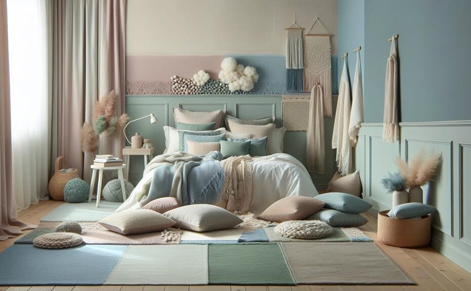
Calming Pastel Palettes

Imagine walking into a room bathed in soft pastel hues – the gentle blush of pink, the soothing lilac, the serene mint green.
These calming pastel palettes have a magical way of enveloping you in a sense of peace and tranquility.
The subtle tones evoke a feeling of relaxation and serenity, making them perfect for creating a harmonious and calming space.
Soft Hues Promote Relaxation
Soft hues gently envelop your space, creating a tranquil ambiance conducive to relaxation. Cozy neutrals and soothing pastels like soft beige, warm ivory, and gentle blush tones provide a sense of comfort and serenity. These colors evoke a feeling of calmness, perfect for unwinding after a long day.
- Subtle Shades: Opt for muted tones such as soft greys, pale pinks, and light blues to instill a sense of peace and tranquility in your surroundings.
- Nature’s Influence: Incorporate gentle blues reminiscent of clear skies and calming greens inspired by lush landscapes to bring a touch of the outdoors into your indoor space.
- Harmonious Blends: Mix and match pastel hues for a harmonious color palette that promotes relaxation. Pair soft lavender with powdery blue or subtle mint green to create a soothing atmosphere that encourages rest and rejuvenation.
Embrace the soothing power of soft hues to transform your space into a serene sanctuary where you can escape the stresses of daily life.
Pastels Evoke Tranquility
Create a tranquil oasis with calming pastel palettes that evoke a sense of serenity and relaxation in your living space. Soft pinks and soothing lavenders can bring a gentle warmth to your walls, creating a cozy and inviting atmosphere.
Imagine walking into a room washed in the delicate hues of pale blues and gentle greens, instantly feeling a wave of calmness wash over you. These pastel shades reflect light in a soft and subtle manner, making the room feel airy and spacious.
Incorporating pastels into your decor can help create a harmonious and peaceful environment. Pairing these colors with light, natural materials like wood or rattan furniture can enhance the serene ambiance. Soft textiles in pastel tones for your pillows, throws, and rugs can further elevate the tranquility of the space.
Whether you choose to paint your walls in soft pinks or add accents of soothing lavenders, incorporating pastel palettes into your home decor can transform your living space into a serene retreat where you can unwind and relax.
Balancing Warm and Cool Tones
To achieve a harmonious color scheme that exudes calmness, it’s crucial to find the perfect balance between warm and cool tones in your space. Balancing warm hues with cool tones creates a serene atmosphere that promotes relaxation and tranquility.
Here’s how you can achieve this balance effortlessly:
- Cool Tones vs. Warm Hues: Experiment with cool tones like blues, greens, and purples to bring a sense of calmness to your space. Combine these with warm hues such as yellows, oranges, and reds to add a touch of coziness and comfort.
- Finding Balance: Integrate warm and cool colors in a way that each complements the other. For example, pair a cool blue with a warm orange to create a striking yet balanced look that appeals to both the senses and emotions.
- Color Harmony: Aim for a cohesive color palette that flows seamlessly throughout the room. Incorporate different shades of warm and cool tones to create a harmonious and inviting environment that promotes a sense of peace and well-being.
Minimalist Monochrome Schemes

Explore a world of serene sophistication with Minimalist Monochrome Schemes, where simplicity meets elegance in a timeless palette of black, white, and gray. Embracing modern elegance and timeless simplicity, these chic minimalism-inspired color schemes exude classic sophistication. By incorporating these shades into your living space, you create a clean, polished look that never goes out of style.
| Black | White | Gray |
|---|---|---|
| Symbolizes strength and elegance | Represents purity and light | Evokes a sense of balance and calm |
| Adds a touch of drama and sophistication | Brings a sense of spaciousness | Acts as a versatile backdrop for other colors |
| Creates a bold focal point | Enhances natural light | Provides a soothing and neutral base |
| Perfect for accent pieces | Allows other colors to pop | Adds depth and dimension |
| Adds a sense of luxury | Reflects cleanliness and simplicity | Offers a sophisticated touch |
Incorporating Minimalist Monochrome Schemes into your decor allows you to achieve a harmonious balance between simplicity and sophistication, creating a tranquil and refined atmosphere in your home.
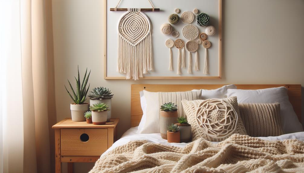
Nature-Inspired Earthy Colors
Immerse yourself in the soothing embrace of Nature-Inspired Earthy Colors, where the warmth of natural hues brings a sense of tranquility and connection to the outdoors.
- Natural Textures:
Incorporate elements like wooden furniture, jute rugs, or stone accents to enhance the earthy feel of the space. These textures not only add depth but also evoke a sense of being grounded and close to nature. - Earthy Tones:
Opt for colors like warm browns, soft greens, gentle terracottas, and muted blues to create a harmonious and calming palette. These earthy tones mimic the colors found in nature, promoting a sense of peace and relaxation. - Soothing Atmosphere:
Pair earthy colors with soft lighting, indoor plants, and nature-inspired decor to cultivate a serene ambiance. The combination of these elements fosters a tranquil environment that promotes a feeling of balance and well-being.
Frequently Asked Questions
Can Color Schemes Affect My Sleep Quality?
Color schemes can indeed affect your sleep quality. When it comes to bedroom decor, the right paint choices can create a calming environment conducive to rest. Opt for soothing colors like soft blues or gentle greens for better sleep.
Are There Specific Colors That Help Reduce Stress?
Feeling stressed? Dive into the world of colors! Discover how mood-enhancing colors like soothing blues and calming greens can help reduce stress. Let these stress-reducing hues transform your space and bring tranquility.
How Can Color Palettes Impact Productivity?
Imagine your workspace transformed by color psychology. Bright hues boost energy, while soft tones enhance focus and concentration. The right color impact can supercharge workplace productivity, making tasks feel effortless and time fly by.
Can Color Psychology Be Applied to Interior Design?
When considering interior design, color psychology plays a crucial role in enhancing emotional well-being. By carefully selecting color palettes that promote calmness and tranquility, you can create a harmonious and peaceful environment in your living space.
What Colors Are Best for Creating a Peaceful Atmosphere in a Bedroom?
Looking to create a tranquil bedroom? Opt for neutral tones and pastel hues for a soothing vibe. Earthy shades bring warmth, while soft blues promote relaxation. Mix and match to find your perfect palette for peaceful nights.
Conclusion
So, next time you’re looking to create a calming atmosphere in your living space, remember to choose the right color palette.
For example, imagine coming home after a long day to a room painted in tranquil greens and soft neutrals, where you can unwind and relax in a peaceful oasis.
By incorporating harmonious blue hues, balancing warm and cool tones, and experimenting with minimalist monochrome schemes, you can transform your home into a sanctuary of calmness and serenity.